 Click on the image to view my welcome video
Thursday 28 April 2011
Wednesday 27 April 2011
Thursday 31 March 2011


Saturday 26 March 2011


Drafts for my DPS page 2:
 This is the plan for my second page of the DPS. As you can see its more craped with writing. this is because its the artiest time to shine on paper and tell fans a little about his life.
  This is the first draft of my second page. As you can see it only has one coloume of writing. I have kept the colours simple (black and green). I used the green to refect the colours on the first page. which keeps things simple. The writing is in a size readable yet I can fit more on the page.
  This is the second draft of my second page. As you can see I have added another coloume of writing but the middel has a big quote form the aritest. The raeson why I done this is to not make the page overflow on writing because my target audience like pictures and this would loose the attection of the audience. I used red because it is bold and make the reader read that first.
This is the third draft of my second page. As you can see I have added another smaller coloume to sum up the writing. Also a page number has been put in to make the rader flow from one page to the next. An image of the artiest has been but in to brake up the writing and give the page a bit of colour. I used the splattered paint effect to give the page a sense of freedom and make the page lively. The word Interviews is located on the top right of the page. This is because the magazine will be in order of the headins on the contents page. So this artical is on the interviews section of the magazine.
Drafts for my DPS page 1:
 This is the plan dor my DPS. As you can see it shows the layout of the lefthand side page. Its simple with few words and a bright picture, it will be easy to grab the readers attection.
  This is the first draft of the left hand side page. It has the background image, which overtakes the page. Also splatered paint effect that was shown in my Front cover and contents page. A logo has be placed in the bottom right hand corner to show the audience that the artiest had a exclusive interview with Studio 5.
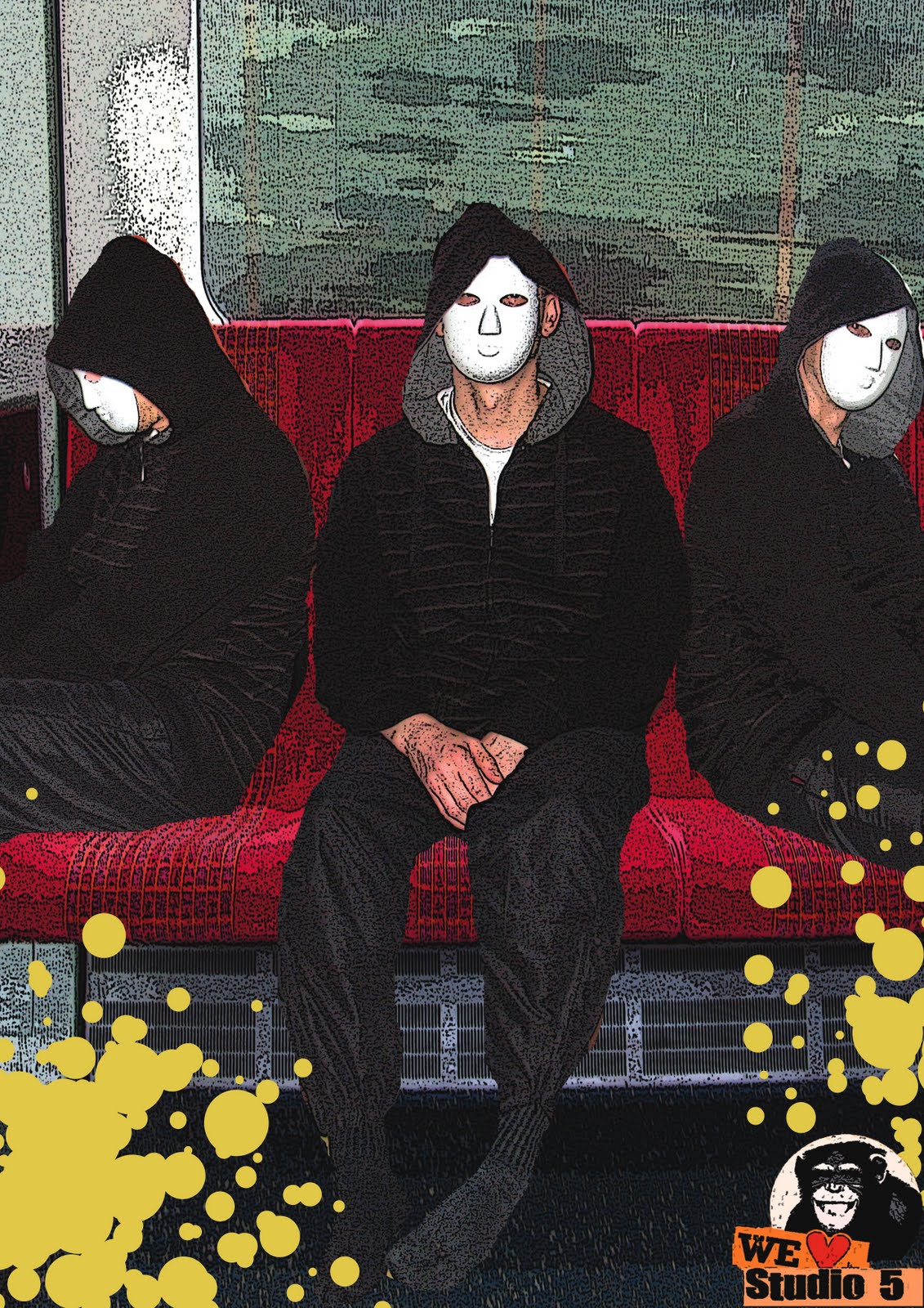 This is the second draft of my left hand side page. As you can see I have added the three croped images of the artiest and placed them on the seats of the train. I used the Free transform button to make the three iamges of the artiest the same size and width of each other.
  This is the third draft of my left hand side page. As you can see I have taken away the paint effect because it looked to cramped and lost the effect of being simple. The heading for the interview is located in big font and bright freen colour at the bottem left of the page. This helps the reader know what artiest the artical is focusing on. The logo has been moved to the top right of the page to make more space and have the effect of being simple.
 Edits to my images for my DPS:

These images have be changed by the photoshop effect Poster Edges. This gives a cartoon effcet, which shows off the bright colours and so will draw the reader's eyes into the page making them read it. I also croped the images with the artiest, using the lasso tool. This gives the impression that the image was taken at the moment in time and shows diffent ways of presenting the artiest, which refelcts the words on the second page.
Chosen Images for DPS:
 This is going to be the background for my left hand side Image. I choosen this image because not only does it reflect the culture of the audience, but has bright, bold coloures to attrect the audience into the artical.
This is one image of my artiest which will be located in the centre of the image (middle seat of the train). I choose this image because the artiest is looking directly at the reader, making them feel connected to the image and so will read the artical.

This is the left view of the artiest which will be located on the first seat on the left. I choose this image because it tells the reader that the artiest have diffent views on life. that he wants to share in the magazine.

This is the right view of the artiest which will be located on the third seat on the right. I choose this image because it fits in with the overall look of the page and that he is directing the audience to the artical. Also tells the audience that the artiest has different views on life.
 This is an image of the artiest which will feature on the second page of the DPS. I choose this image because it keeps the page busy so it does not loose the readers intrest. Also to reflect another side to the artiest.
Wednesday 9 March 2011
Drafts for my contents page:

 This is the 1st draft of my contents page and shows the white background and the brown strips that I used in the front cover but this time they are in a different angle. Plus the masthead "Studio 5" and what the page is "contents". which is in the font used on the front cover, to make it flow with the look and theme of the magazine.
 This is the 2nd draft of my contents page, as you can see I have added the various categories that the magazine is split up into. Regular is for what comes in time after time in the magazine. News is for the up to date information on technology and the music world. Interviews is a chance for the artiest to promote their music and share exclusive information about there lives.
  This is the 3rd draft for my contents page. As you can see I have added the paint effect to make the contents page have a sense of freedom and flow with the front cover. I also added images that reflect the sub-headings, for example the headphones relate to the page under News. The head of the editor is related to the page under Regular and the image located in the bottom right hand corner is of one from Interviews. I have also put in the page numbers that the image is on.
 Feedback For my Contents Page:
My overall presentation of my contents page was good, but lacked some of the key feature of a contents page for example no information on the subscription offer, no quote from artiest and no issue number or date of the magazine. which means that it would not give a good impression to the reader and so will be more likely to put it back on the shelf.
 This is the final draft of my contents page. As you can see I have put in the missing features listed above, which make the contents page more busy and so will suggest to the reader that the magazine has lots of content to read and will be more likely to buy the magazine.
chosen images for my contents page:
 I am going to crop this image using the lasso tool in photoshop and this is an image to represent the technology for the magazine.
 I am going to crop the face using the lasso tool on photoshop and this would be an image to represent the editor of the magazine.
  This is the backgroud of one of my images contents page. Which the three images below are going in front of this image.
 I am going to crop this image with the person in the mask using the lasso tool on photoshop, which I will add onto another image.
  I am going to crop the image to the person in the mask using the lasso tool on photoshop, which I am going to add onto another image.
 I am going to crop the image to the person in the mask with the lasso tool on photoshop to put it in another image.
Sunday 6 March 2011
Masthead:


The reason why I did not choose this font for my magazine is because same with privous ones I would give the wrong impression on the audience and so will loose intrest in the magazine.

The reason why I did not choose this font is because it gives the impression that the magazine would look scruffy and loose the appel of some of my target audience.

The reason why I did not choose this font is because it would appel to a younger audience because it looks like one people see in cartoons and not in Hip Hop/DJ magazine.
 The reason why I did not choose this font is because the font did not reflect the theme/genre of the magazine.
The reason why I did not choose this font is because some people may think that the d and o are hard to read.
Saturday 5 March 2011
Drafts for my front cover:

 This is the 1st draft of my magazine. As you can see there is the central dominate image, which overtakes the page. This is because it tells the reader that this is the main person they will focus on in this issue. I also put in the masthead "Studio 5" to tell the reader what magazine it is. The background is white with four large brown strips to make the front cover less boring and not lose the interest of the reader.
 This is the 2nd draft of my magazine. This time I have put on cover lines which are located on the left of the page. This is to tell the audience some of the issues or articles that feature in this issue. Plus at the top right the reader can see a number "127" this is the issue number and I plan to put in the mouth when the issue came out. Also there is a larger cover line about the main artiest in the magazine " Mr.A The Legend of Technology". this is to tell the reader a short line of what the artiest is about and if you are already a fan then the reader will be more likely to buy this issue.
  This is my 3rd draft of my magazine. As you can see I have put in a barcode with a price located above. A strap line has been created "Create*Experience*Share". I chose these words because the reader can create his/hers own music, experience other peoples music, share their music online via sites like You Tube, Myspace and Facebook.
 There is also a spalted paint effect used to make the magazine seem as if it is free and can let go of rules from time to time.
Feedback for my front cover:
The overall presentation of my front cover was great but font size of masthead and cover lines need to be bigger. Plus " Mr.A The Legend of technology needed to be increased in size. Also the central dominate image needed to be put higher as there were areas of dead space which needed to be field up. I also needed something put on the top right hand corner because there nothing there. Down below is the new and improved version of my front cover.
As you can see I have added a logo on the top right hand corner to get rid off the dead space. The logo will feature in most of my pages of the magazine. The central dominate image has been moved up, this is to make it fell up the page. The font on the masthead, strap-line and the headings of the cover lines have been increased to make the page more busy and attract the readers attention. Also the main heading of the page has been increased to make the reader aware that Mr.A is the main focused of this issue.
Friday 4 March 2011
Edits to my chosen image:

First I opened my image in photoshop and decided to choose an effect that would improve the image and give it a sense of being urban.
 Secondly I chosen the effect cutout because it shows good tone and use of simple colors so that the reader does not get confused with the image.
I then cropped this image using the lasso tool on photoshop.
Chosen image for my front cover:

This is the chosen image for my music magazine. The reason why I chosen it is because it tells the reader that the artiest is wearing headphones to suggest that music is his passion or that he has prosued it as a carrier. It also shows his iconic mask that he wears so people don't know his full identity. plus he is wearing a hoodie which is iconic to the age range but culture that the magazine is aimed at.
The reason why I put the artiest in a side shot is because it relates to his hidden identity and makes the reader more interested and so are pursued to buy the magazine.
Subscribe to:
Posts (Atom)